
GIESEN
Water
Giesen Wines have added a still and sparkling water to their portfolio. An elegant bottle that reflects their Sauvignon Blanc was created with sand etched patterns to differentiate the still from the sparkling. Restrained use of type and branding in line with the existing portfolio was then applied.

DEPT OF SOUL
Identity and Packaging Development
Bold, contemporary, unisex design for a New Zealand based natural deodorant company.

RAPAURA SPRINGS
Label Design
Finely crafted elements are employed to elevate the premium status of this single vineyard wine. The creation of a Seal focuses on the provenance by locking it up the a detailed version of the Icon and location in a highly crafted way.
The prominence of the brand has been reduced to highlight the bespoke nature of this wine.

CALVERT VINEYARD
Identity and Label Design
A premium Central Otago Pinot Noir.
A wine with
great personality,
borne of small things
done beautifully.
The design style takes its cues from the above statement. Minimal and refined it uses quality print effects to enhance the premium nature of the design.
Glittering quartz flecks reflect
the sunlight back up to the fruit,
ripening it from the earth beneath.
The graphic elements on the label have been created to subtly illustrate the reflection of light shining from below.
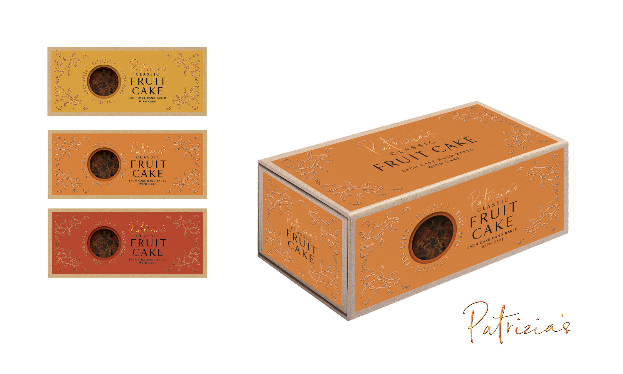
PATRIZIAS
Hand Baked Cakes
The packaging is rich and luxurious.
A crafted hand drawn leaf pattern has been created to frame the information and reflect the hand baked quality of the cake. It has the feel of a traditional cake tin made from pressed tin while being executed in a contemporary way.
The luxurious copper foils compliment the muted feel to colour on craft board. A range of colours have been printed so the purchaser gets a choice instore and further adds to the story of a individualised product.

APPLEBY ICE CREAM
Packaging Concept
Appleby ice cream sources its ingredients from local suppliers and can trace the origins of everything that goes into its production. This story of origin leads the packaging design and is told through the illustrations on the pack. Boldly realised, the illustrations are applied in metallic foils, firmly positioning Appleby as a luxury New Zealand product.

BELLHILL
Identity and Packaging
The Bellhill identity reflects an artisan approach to wine making, acknowledging the harsh limestone environment and the very exclusive, limited edition of each release.
Each Bellhill wine label is individually numbered. The labels are letterpressed on cotton content paper communicating a subtle quality that also has a certain rough, handmade feel.
The plain brown screen printed box, tissue wrapped bottle and limited edition landscape print of the vineyard complete the experience of receiving a case of this exclusive, mail order only boutique wine.
DINZ Small Identity | Gold
DINZ Packaging | Bronze
Type Directors Club | Publication
in Design Annual

BELLHILL
Grappa
This creative utilises an early cut of Futura, the primary font for Bellhill communications. Styled in a similar way to the original logo this graphic makes up the primary focus of the packaging. It is printed onto clear substrate with black lines that go around the circumference of both the bottle and the tube.

CLOUDY BAY
25 Year Visibility Promotion
In a world where people search for connection, Cloudy Bay provides an opportunity to realise that search.
To mark 25 years of quality wines the Light Weave visibility campaign was developed.
To express the idea of connectedness a ‘weave’ graphic device was turned into a suite of display material which play on light and translucency. New Zealand lighting designer David Trubridge was commissioned to create a glowing plinth and ice bucket. Gift boxes and communication materials were also developed to give the campaign a wide reach.
DINZ Packaging | Gold
DINZ Small Identity | Gold
DINZ Environmental | Silver
COMMUNICATION ARTS PACKAGING |
Publication in Design Annual


CLOUDY BAY
Te Koko
The legend of Te Koko begins centuries ago with the great explorer, Kupe, who pursued a gigantic taniwha far across the Pacific Ocean. According to the story, Kupe finally caught and killed the frightful taniwha in New Zealand’s Marlborough Sounds.
While exploring this new land, Kupe’s canoe was driven into a sheltering bay where he dredged for oysters with a scoop. Local Maori named the bay Te Koko-o-Kupe, or “Kupe’s scoop”,
an area commonly known today as Cloudy Bay.
It was in this spirit of exploration and adventure that the wine Te Koko was born.
When creating a new identity for Cloudy Bay’s premium Sauvignon Blanc, inspiration was sought from the rich heritage of the area. The story of Te Koko was incorporated into the design with a pattern representing the ripples left by Kupe’s waka. This subtle element embraced the Te Koko legend in a modern and sophisticated way.
DINZ Packaging | Silver

CLOUDY BAY
Te Wahi
Te Wahi is the iconic Pinot Noir in the Cloudy Bay Portfolio which sits alongside Te Koko. The name meaning ‘The Place’ was developed to reflect New Zealand as a whole rather than Marlborough as the grapes for this wine may be grown in Otago. A darker palette was adopted to compliment the deep rich tones of this varietal.

CLOUDY BAY
Pelorus Labels and Gift Box
The Pelorus labels and gift packaging were redesigned to strengthen the brand codes of the Cloudy Bay brand while respecting the unique personality of the sparkling varietal.
A watercolour of the iconic Richmond Ranges was commissioned to reflect the craftsmanship and artistic nature of this wine in a fresher and more fluid manner than that of the existing brand image.
High production values reinforce the wine’s premium price point. Heavy textured stock, embossing and pearlescent ink are complemented by classically treated typography to create a package of lasting elegance.

45 SOUTH SENTENNIAL CHERRIES
Packaging Range
Showcasing the pure natural environment that these cherries are grown in while highlighting New Zealand will appeal to a Chinese market. Using an unexpected circular type layout will help grab attention in a crowded market.
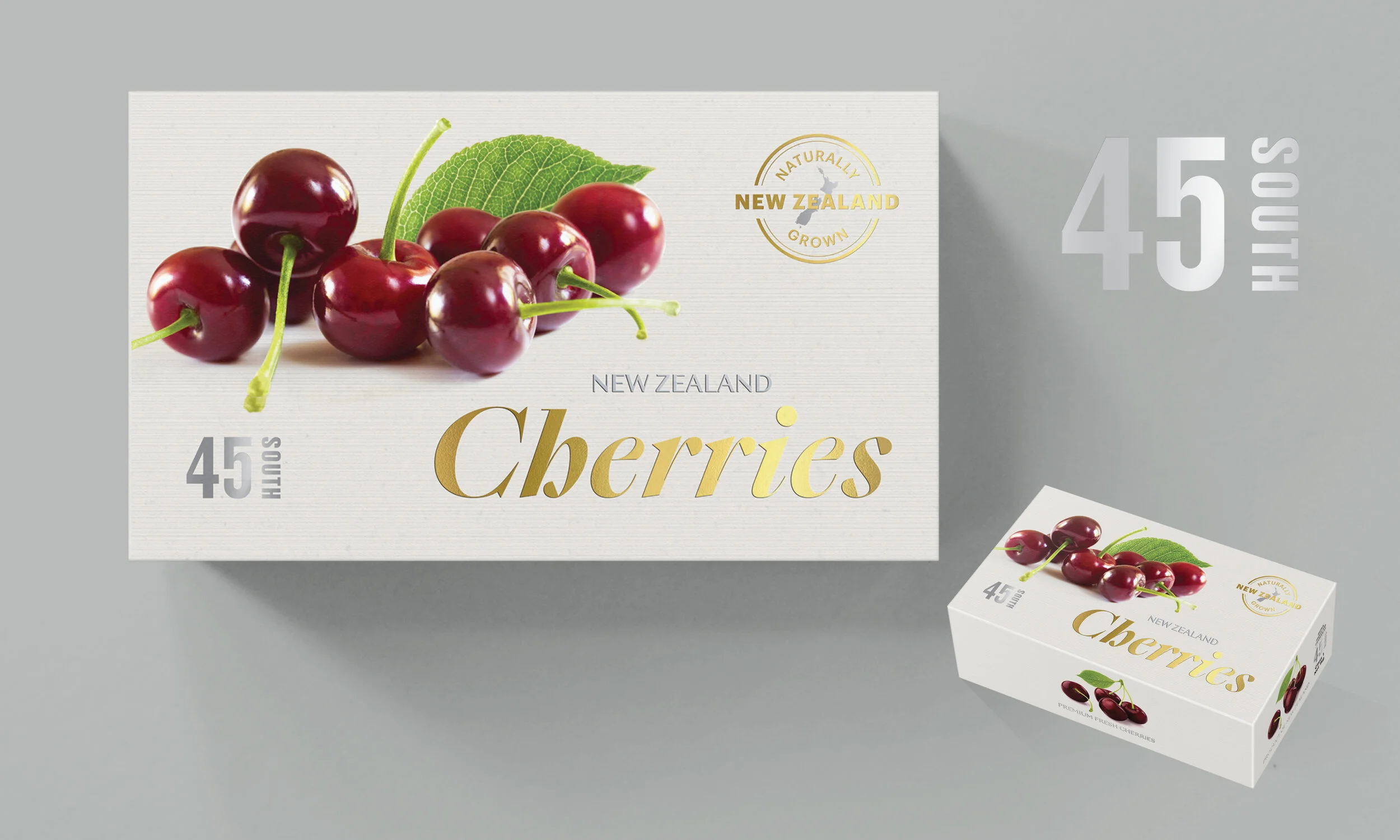
45 SOUTH WHITE LABEL CHERRIES
Packaging Range
Premium Cherry variety for the Chinese market. Gold, red and white have been used to appeal to a Chinese design aesthetic, while the clean paired back design will help stand out in the cluttered market.

ODERINGS
Packaging
Oderings is a family business with its primary focus in Garden centres. When developing the new identity the crest was redrawn in a contemporary way that strengthens the core company offering while anchoring the identity in its rich heritage. The tree symbolises both family heritage and strength in nature. A range of textural illustrations was created to bring the identity and packaging to life.

KATHMANDU
Packaging System
In keeping with the eco tech brand positioning of Kathmandu, a packaging system utilising recycled stock and minimal print finishes was created for use throughout the store. Typographic hierarchy was purposefully consistent across all products.
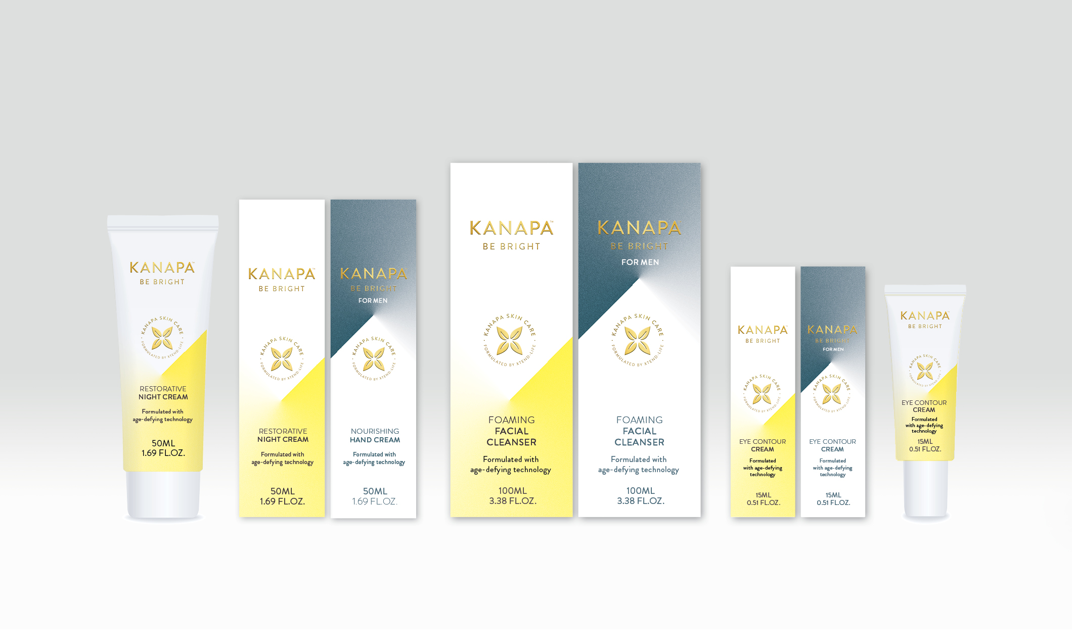
XTENDLIFE
Kanapa Cosmetics Packaging Concept
A shining light in beauty.
Light play is expressed by using dynamic angles and blends that mimic light projected onto a form. The fresh colour adds vibrancy and energy to the packaging. Arresting patterns are created on shelf when products are displayed together.

GUISE
Scarf Design, Identity
and Packaging
This identity and packaging were developed to market a range of silk scarves that I designed and hand screenprinted for commercial sale.
The scarf designs were incorporated into the packagingto create variety and reflect the bespoke nature of the product.

CAPE MENTELLE
Food Pairing Imagery
A range of images to set the tone of how the Cape Mentelle brand will be seen in the market was created for the core wine portfolio.
A strong contemporary feel was adopted using natural interiors to enhance the positioning concept of ‘Refinement from Ruggedness’ a phrase that captures both the raw, fresh and invigorating nature of the region and the subtle, elegant stylish nature of the wines they produce.
Gift Packaging
A gift box was created for Cabernet Sauvignon, the iconic wine in the portfolio.
Designed to mirror the rich subtle feel of the label. The Margaret River tree line was employed to create strong links to the wine region.
Packaging