
FOIL
Longbeach Apparel
Womens Fashion Brand
Turning a label into a brand.
Timeless, contemporary style. This brand has been developed to stand alone from the other Longbeach fashion labels. Systems to promote it in US, UK and Australian markets have been developed to maximise online and in-store presence.


RAVENSDOWN
Identity Development
To make a stronger connection with farmers all aspects of the brand identity were addressed.
As well as a new logo, a plain talking newspaper style font was selected to work alongside an organic abstract brand pattern, technical info graphic illustrations and a brand library of photography.
The suite of tools was used to bring the positioning to life across all applications.
The brand image library was created to portray honest, direct conversations with farmers showing a hands on company that works alongside its shareholders.


RAVENSDOWN
Advertising Templates
Design system to provide consistency across a range of digital and print media.

RAVENSDOWN
Editorial Design
Creation of a templated design system for the national newsletter took the form of a news magazine, utilising several grid styles to create variety incorporate various forms of information.

CLEARTECH
Identity Development for a Ravensdown Sub Brand
ClearTech is a new on farm technology system for water recycling and effluent reduction. The sub brand will sit below the Ravensdown master brand but needs to reflect the environmental value that it will add on farm.

RAVENSDOWN
Good to Go
Identity Development
Internal brand communication platform and identity development for the internal Health, Safety and Wellbeing initiative.
Creation of a design system to convey straight talking messaging to staff and visitors that extends beyond traditional safety.

TOI OHOMAI INSTITUTE OF TECHNOLOGY
Identity Development
Toi Ohomai is a learning institute that covers a large geographical region and forms a network of Purposeful Connections between its locations.
United in the exchange of knowledge, Toi Ohomai is intrinsically woven into the region, forming constellations of excellence, expertise, people, partnerships and innovation.
The Toi Ohomai Visual Identity System brings to life the idea of Constellations of Purposeful Connections.
These connections result in individual and collective success for the whole region.


KATHMANDU
Identity Development and Brand Standards
The company brand architecture was defined to enable the master brand to work cohesively with a variety of sub brands on a vast array of applications. A comprehensive guidelines was then created.
This guidelines includes architecture systems for applying the brand to product, packaging, signage and corporate communications.
DINZ Large Scale Identity | Silver
AGDA | Award

KATHMANDU
Brand Book
The brand book was developed to educate the staff and public. The story of the brand philosophy is told through a series of aspirational images interspersed with paired back copy pages.
DINZ Corporate Communications | Silver

KATHMANDU
Packaging System
In keeping with the eco tech brand positioning of Kathmandu, a packaging system utilising recycled stock and minimal print finishes was created for use throughout the store. Typographic hierarchy was purposefully consistent across all products.

NEW ZEALAND JAZZ & BLUES FESTIVAL
Identity and Advertising Concepts
Development of a font was integral to the campaign. Designed to reflect the rhythmic nature of the music, distinct tones and shapes pulse within the forms.
When words are created unique visual scores come to life.
The font was applied to create blocks of images with a strong rhythmic nature. The tonal blending was at times interspersed with a small pulse of colour to reflect the heart of the music. When multiple posters were seen together the visual play of the rhythm was strengthened.
DINZ Visual Communications | Bronze
DINZ Small Identity | Bronze
DINZ Typography Design Arts | Bronze


BRAINTREE
Identity Development
Brand Identity design system for a brain health wellness centre. A toolkit of elements have been created that portray the warmth, diversity and care of our brand. Human and neurological connections are portrayed through a graphic that looks deep into the branches of a tree.

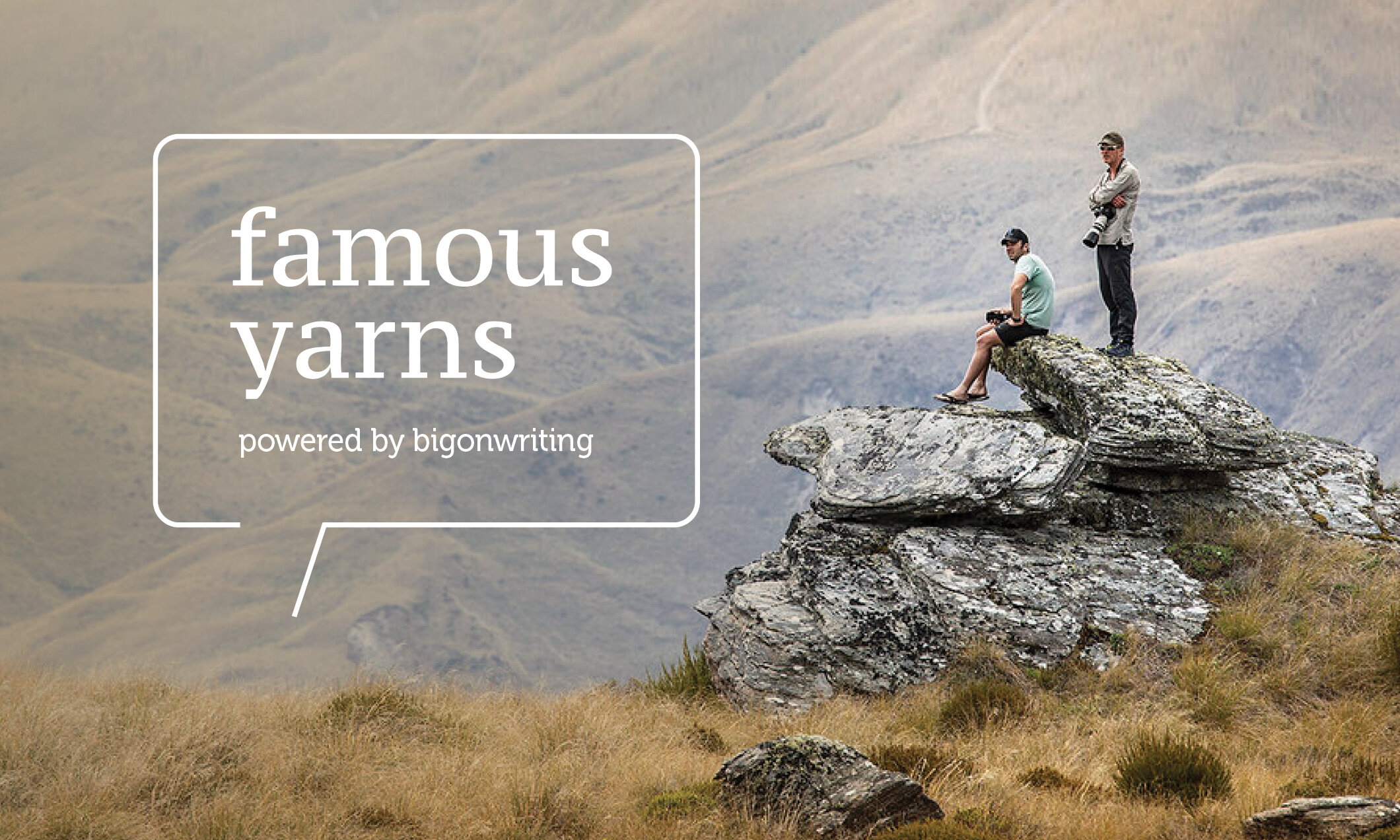
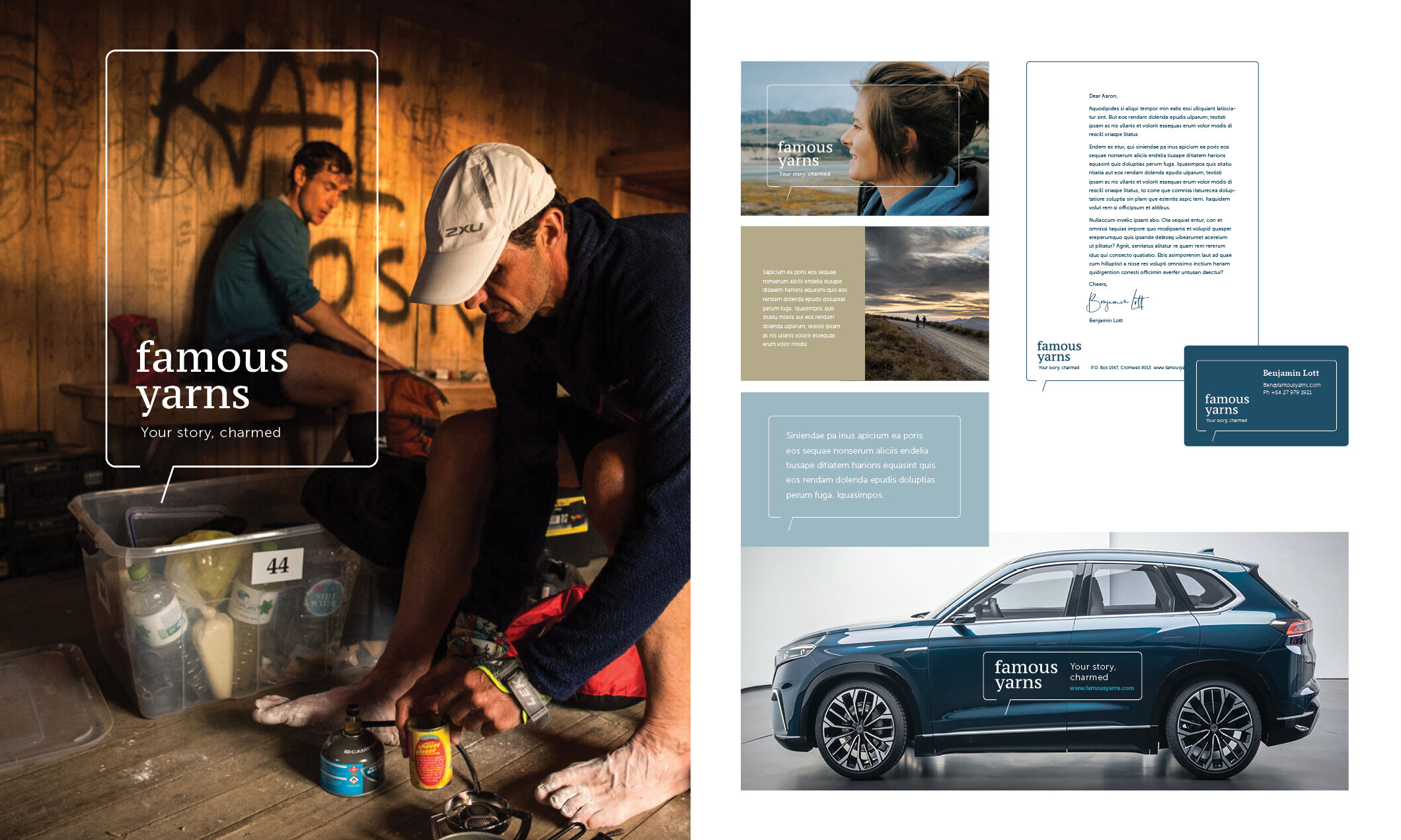
FAMOUS YARNS
Identity Development
With every brand comes a yarn. A pitch to your soul. A reason to connect.Famous Yarns create brand stories for companies and individuals in New Zealand and North America. The identity is expressed through the malleable Yarn Frame, a speech bubble that implys the communication of a story as told by Famous Yarns.The frame is fluid and can morph to support a variety of information as required.

APPLEBY ICE CREAM
Identity and Packaging Concept
Appleby ice cream sources its ingredients from local suppliers and can trace the origins of everything that goes into its production. This story of origin leads the packaging design and is told through the illustrations on the pack. Boldly realised, the illustrations are applied in metallic foils, firmly positioning Appleby as a luxury New Zealand product.

MARGARET MAHY FAMILY PLAYGROUND
Identity Development
The design approach focuses on a sense of joy and engagement for everybody.
A combination of layering and scale introduces diversity into the mark, reflecting the broad range of activities that a large range of people can enjoy. The positioning of the elements reflects the sensation of a spinning poi to reinforce the Maori translation.
The combination of shape, size and colour come together to create a lively, fun and positive engagement with the Playground.
A strong family focus has been brought into applications by showing direct interaction of people/families with elements of the mark, ensuring the Playground is seen as a place for everybody.


ODERINGS
Identity Development
Oderings is a family business with its primary focus in Garden centres. When developing the new identity the crest was redrawn in a contemporary way that strengthens the core company offering while anchoring the identity in its rich heritage. The tree symbolises both family heritage and strength in nature. A range of textural illustrations was created to bring the identity and packaging to life.


FESTA
Identity Development
Design System promoting the Festival of Transitional Architecture. A public festival of architecture, design & food that brings a weekend celebration of urban creativity to the central city.


DEPT OF SOUL
Identity and Packaging Development
Bold, contemporary, unisex design for a New Zealand based natural deodorant company.


TE PUTAHI
Identity Development
A fluid design system for the Centre for Architecture and City Making. The logotype is constructed in layers. A pathway runs through connecting the elements while defining spaces within. Application is malleable but still retains a strong recognisable form.


CHRISTCHURCH ARTS FESTIVAL
Identity Concepts
Creating a unique sense of place that
anchors the Festival firmly in the architectural landscape of Christchurch by creating a graphic system based on architectural details synonymous with the city. Vibrant and engaging all of the details come together to create a spectacle that is uniquely Christchurch.


ORBIT
Identity Development
Fresh and engaging the logotype is symbolised through the refined circular letter forms and holding device. The overall logo is sophisticated and open, it feels approachable and refined.
The colour palette is a contemporary take on a blue sky theme to reinforce the aspirational values of the company. Using a blend of these colours will further emphasize the movement implied by orbiting.

LINESPEED
Sports Wear Label

GREATER CHRISTCHURCH URBAN DEVELOPMENT STRATEGY
Identity Development
The design idea needed to reflect a unique approach to public consultation.
A distinctive visual language portraying woven conversations that subtly reference the braided rivers of Canterbury was developed. A typeface to further strengthen the story was also created.
The threads of individual voices create a collective picture, forming a flexible visual language capable of evolving over time.

LAMB & HAYWARD
Identity Development
Lamb & Hayward funeral directors deliver guided personalisation, supporting the family in honouring the unique life of their loved one. All done with the reassurance of the quality that Lamb and Hayward is known for.
The identity needed to shift the business from the appearance of exclusivity and authority to be inclusive, human and understanding.
When developing the identity an iconic linking device was created to reinforce the relationship between Lamb and Hayward and its customers. The device brings alive the idea of partnership and is paired with sophisticated imagery unique to the Canterbury region.

FILLOSOPHY
CRAFT BEER FILLERY
Identity Development
Fillosophy is an off license that retails craft beer on tap direct to the public. The ‘f’ and the ‘i’ create an icon within the type mark which can also be used independently. The colour palette utilises rich warm amber hues of the beer.
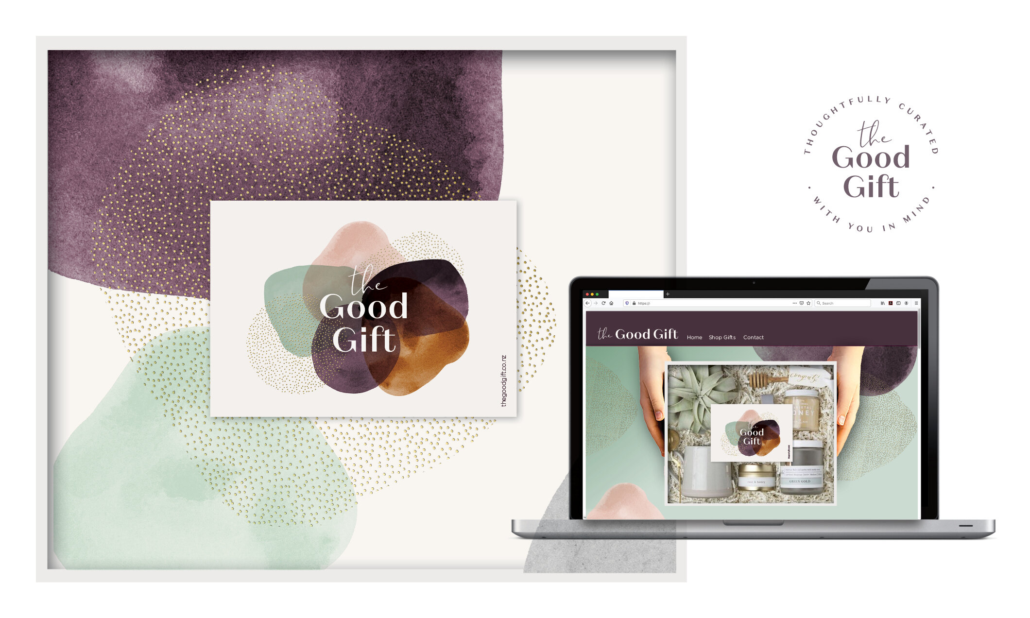
THE GOOD GIFT
Identity Development
A fresh identity and packaging system for a curated gift company. Soft textures with a sprinkling of foil are the first touch point of the customer journey creating an introduction for the quality and special nature of the gift within.

LIM CLARKE
Identity Development
Lim is a young New Zealand music producer. An iconic mark that utilises his unique name and reflects the intensity of his music was created. The graphic nature ofthis mark can be configured in a number of ways reflecting the rhythmic nature of the music he produces.


GE JOINERY
Identity Development
A joinery firm, the logo was developed with a focus on cutting edge precision, executed in a linear pattern that links to the grain in wood.
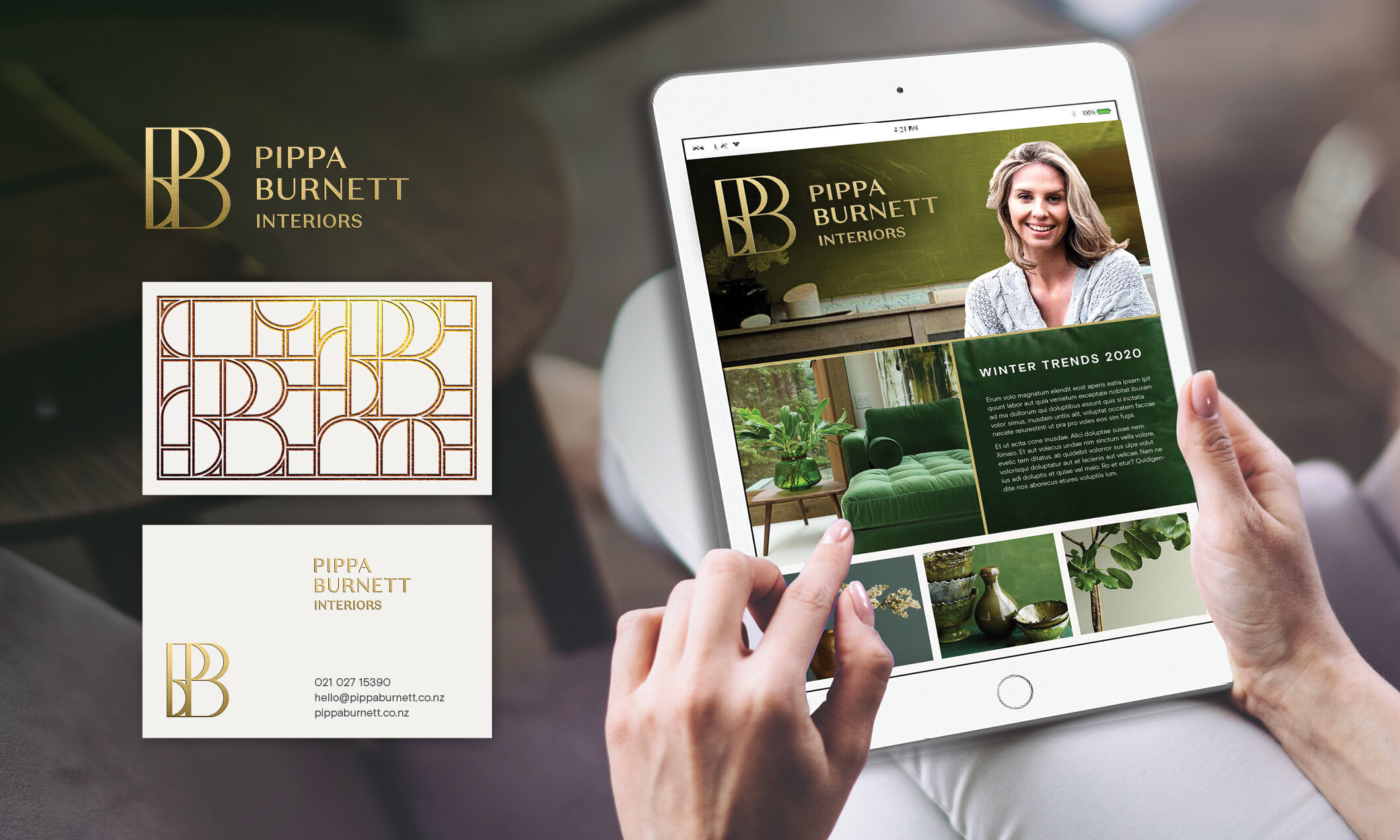
PIPPA BURNETT INTERIORS
Identity Development
Contemporary, classic and timeless. The identity works as a signature to show quality and reflect the design aesthetic of the business.
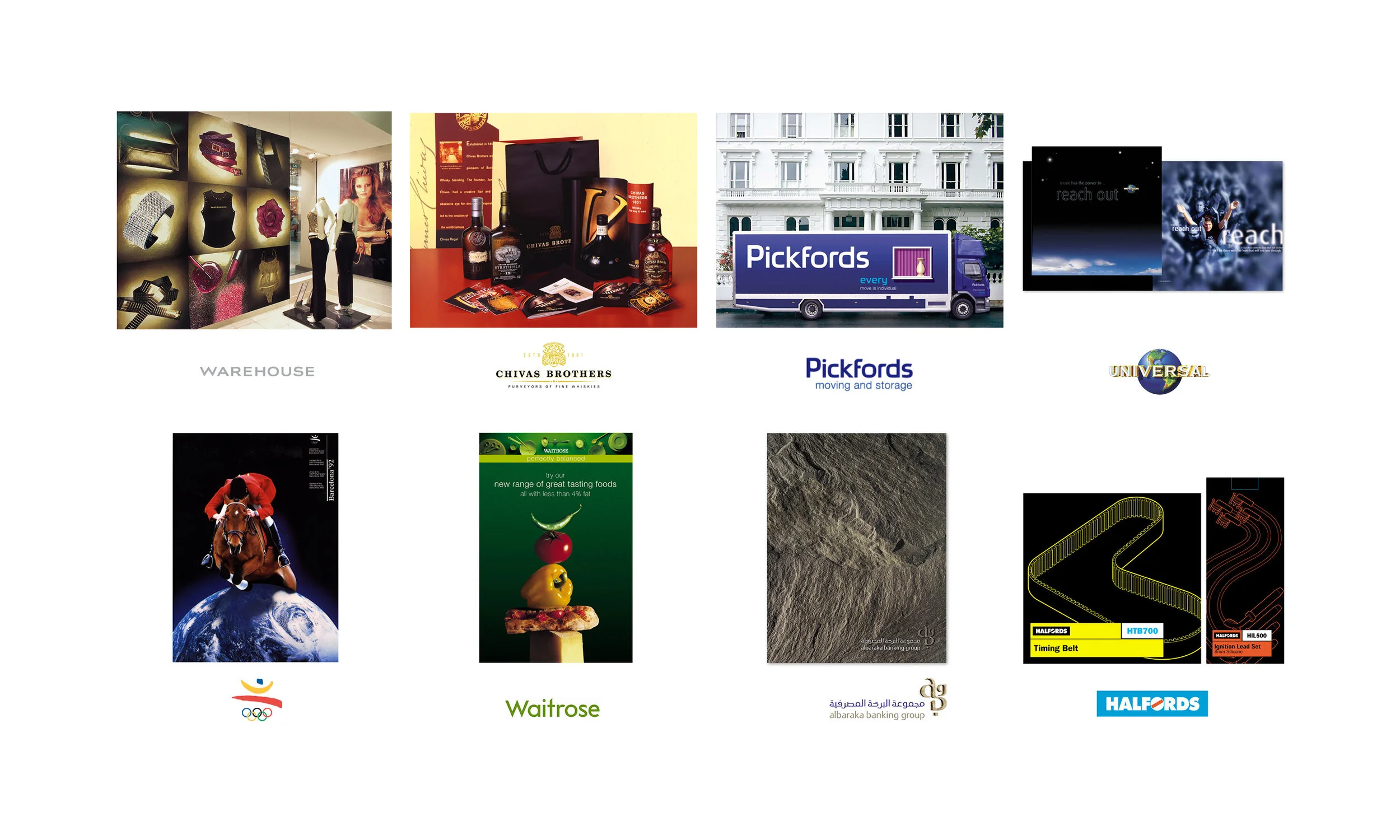
UK PORTFOLIO
Clients
The images on these pages show a cross section of the clients and projects that I was involved with while working in the UK.

Brand Identity Large Scale
Brand Identity Small Scale
UK Projects